TypeCon Daily Schedule
Click to view day:
Thursday
Type & Design Education Forum
12:00
Opening Remarks
Sharon Oiga & Guy Villa Jr
Block 1
12:05–12:25
Publishing Praxis
“One publishes to find comrades!” — André Breton
This talk presents diverse examples from a project entitled ‘Future Publishing’ that tasks graphic design undergraduates — through technē and poiesis — to find a form to publish their 7000 word thesis essay for an audience (beyond their theory tutor).
The definition of ‘publish’ is pushed to include the physical, digital, experienced, participatory, audible and immersive. Textual thesis content is editioned, edited, re-organised, expanded and sometimes performed in a range of project outcomes that explore ‘Publication as’...book, object, exhibition, event, prototype, dialogue, reflexivity, gamification, voice and metaphor.
The talk will also share an event where academic and student discussion of the project (amongst the outcomes during degree show exhibition) fed into a publication entitled ‘Publishing Praxis’ that analyses areas of research around experimental publishing that have emerged from the conditions set by the ‘Future Publishing‘ project. The publication was run as a collaborative design project with alumni and students, with the design itself seeking to further challenge publishing practices and the form of the ‘book’.
12:25–12:35
Experimental Typography with Physical Computing and Extended Reality
How does one utilize interactive typography, virtual reality, and physical computing to effectively tell a story? This presentation will detail my graduate thesis project An Elegy for the Departed, an installation and performance integrating writing, design, and engineering.
Originally designed for the CAVE2 large-scale virtual-reality system, the Elegy is an immersive environment connecting the physical body to its digital metaphor. With a gyroscope device tracking my gestures, my movements during the performance influence the motions of typography in the scenes. The characters rotate, stretch, and float as I move my hands around.
In the presentation, I will discuss the process of developing my thesis idea, my experimentations, my design methodologies formed during this time, and I will demonstrate the result of my project.
12:35–12:55
The Future of Typographic Education: Decolonising, Defuturing & Artificial Intelligence
Typography is an integral part of our daily lives. From digital interfaces to printed publications, typography is used to communicate messages and ideas. However, as we move towards a more diverse and inclusive world, it’s important to consider the role typography plays in shaping our understanding of the world. This paper explores the future of typographic education through the lenses of decolonisation, defuturing, and artificial intelligence (AI).
The future of typographic education is a complex and multifaceted topic. Decolonising and defuturing can help us create a more inclusive and equitable visual language, while AI has the potential to revolutionize the way we approach teaching. By engaging in critical conversations about the future of typographic education and exploring alternative possibilities, we can better prepare ourselves for the changes that are to come. Ultimately, the goal should be to create an approach that is reflective of the diversity and complexity of the world we live in, while also pushing the boundaries of what is possible.
12:55–1:10
Q&A
1:10–1:30
Networking Break
Block 2
1:30–1:50
Lego Type: Modular Letterform Making with Lego Bricks
This lecture will focus on the research developed at the UIC School of Design through a series of exercises where students were tasked with creating modular letterforms using Lego bricks, and then using the letterpress to print their designs.
By designing letterforms using a modular approach (bricks), there was an opportunity to explore how individual parts could be combined and rearranged to create a range of different shapes and structures. What can we learn from designing letterforms using such a gridded and restrictive system? How important is scale, resolution, and individual brick shapes for the readability and legibility of a letter?
Using the letterpress added an extra layer of complexity to the exercise, as students had to consider how their designs would translate into the physical printed form. In this way, students were able to understand and develop their typographic sensitivity in a didactic and engaging way.
1:50–2:10
From Struggle to Success: Navigating a Return to Student Workplace Readiness
How can design educators balance caring for an anxious student body while still accounting for the realities of an often demanding field? This talk highlights key challenges we face when preparing students for the workforce, especially in the post-COVID era. We will share observations from industry professionals, who note a change in resilience and risk taking — the very skills creatives use in problem solving. Feedback from senior creative directors who have hired recent graduates, paired with survey data from other design educators, will provide a range of perspectives. We will cover actionable approaches to pedagogy and propose mental wellness habits as a necessary “soft skill” for today’s students. Throughout the talk, sample student work will provide a glimpse into how mental health topics show up in the classroom. Finally, we share resources and studies that contextualize some of the most common concerns flagged by design educators.
2:10–2:30
Teaching Indigenous Type Design
This talk will share insights from a Native American instructor teaching a mixed group of interaction and communication designers, artists, and exchange students taking a fourth year course in type design at Emily Carr University of Art + Design (ECUAD).
The course and presentation strive to engage with decolonization and indigenization, including approaches to administration, course outlines, two studio assignments, and community building. I will give insight into my practice, what it’s like in British Columbia at ECUAD, and my approach to teaching type design. I will also showcase the amazing work taken on by the diverse group of students I had last fall, and where they are coming from with this work.
2:30–2:45
Q&A
2:45–3:15
Networking Break
Block 3
3:15–3:35
Venturing Beyond Latin Types in an Introductory Course
My entry-level Typography & Visual Culture course surveys type history, asking students to use historical designs in mock-up projects of increasing complexity. For the newly revamped final project, students expand the typographic palette for an endangered writing system.
Each student is assigned their own writing system. They research its history, structure, and appearance, and learn about the people and cultures it serves. Based on that research, students invent realistic scenarios that would require display typography in that script. They peruse retail websites of Latin types for designs that would fit each of their scenarios. Lastly, they draw what glyphs in their assigned script would look like if when stylized like their chosen Latin display type. Students are challenged to envision typeforms that have never existed. They wrestle with pressing questions: Does adding Latin-style features to non-Latin forms constitute insensitive Latinization? How might modulation be added to traditionally monoline glyphs? To what extent are Latin conventions transferable or translatable to other scripts? For a non-native designer, what are the opportunities? Limits? Responsibilities?
3:35–3:45
Type As Conceptual Exploration for Social Concerns
This presentation will focus on an advanced level graphic design project where students begin by writing a research paper on a chosen typeface learning its social impact and understanding why and how the type was used in the past. For example, students learn about the history of Blackletter and how it remains widely used in Mexico, a popularity that began with the Spanish colonization of the country, and they learn about Fraktur, a variety of Blackletter that was later adopted by Hitler as the official typeface of the Nazis.
After students complete the research paper, they are asked to address a social problem, using the typeface they’ve researched as a guide for conceptual exploration. Students decide the means of output for their projects. The typeface that they researched must be a focal point of their project. For example, a student who researched Futura then used that typeface to design a book titled “The first 100 days of Donald Trump,” mixing political commentary with hand drawn illustrations.
This presentation will explain how allowing students time to research a typeface has been a tool for creating a deeper connection between type and addressing social issues.
3:45–4:05
Planting Seeds of Diversity
Students of graphic design programs often feel daunted by their future prospects. Those that take a typeface design class expect to learn how to make fonts that might enjoy popular success, which means working in the Latin script is taken for granted. But education is essentially about planting cultural seeds, and the typographic diversity of the world's scripts is a seed that is as crucial as it is vulnerable.
Teaching a typeface design course at California State University at Los Angeles since 2019 has afforded the opportunity to expose students to the responsibility of supporting this diversity, and its joy. They are guided towards the discovery of writing systems that speak to their own identity and vision. Although rarely developing an entire character set for a script, they nonetheless design key components that develop their sensitivity, acquiring a confidence and love of nurturing typographic diversity throughout their design career.
In this presentation the results and experiences of the students will be shown and discussed, hopefully fostering an expansion of this educational ideology anywhere typeface design is taught.
4:05–4:20
Q&A
4:20–4:50
Networking Break
Block 4
4:50–5:00
Impossible Typefaces: A Project Case Study
In his essay “About the Typefaces Not Used in This Edition,” Jonathan Safran Foer documents several imaginative typefaces—each one increasingly impractical—that were not selected to typeset his latest book. Examples include a typeface that continually refreshes itself by replacing words with their antonyms and another that requires the typographer to tattoo birds’ wings with each word of a given text. This quirky essay raises the question: Might some more “impossible” typefaces exist? This talk will present an Advanced Typography project in which graphic design majors responded to this essay by designing and documenting a new, “impossible” typeface. The assignment challenged preconceived notions of a typeface’s purpose, scope, and power, and introduced my students to the practice of Critical Design (as championed by London-based designers, Anthony Dunne and Fiona Raby). The talk will unpack students’ processes—from conception and research to finished deliverables and performances. Outcomes were produced in a wide variety of mediums, including animation, sculpture, hex codes, and creative writing. Opportunities for improving future iterations of the project will also be discussed.
5:00–5:20
Evolving Writing with Technology
As technology has advanced, communication styles have evolved toward a visual language rather than written. This is an opportunity to create a new form of writing for people that utilize smartphones and other technology. Using cuneiform writing, one of the oldest syllabary languages made from wedge-shaped symbols, as a basis, new symbols resembling emojis can be created by introducing technology. Various shapes and a number of languages can be represented using many different mediums. Vector shapes, coding, AI, etc., can all be used to create a new modern language.
In this presentation, I will share my research on generating a new version of cuneiform utilizing AI with varying inputs and results. Experimentation produced different types of images which are very different from the original shapes in cuneiform. Through this experimental image generation, we can see similarities to, and the precision of, typefaces and letters which resemble and imitate the appearance of old-style characters of cuneiform or other ancient typefaces. This endeavor resulted with something distinct while retaining the spirit of its original.
5:20–5:40
Teaching Type as the Final Frontier
Relatively speaking the tools used to craft, produce, and publish typographic forms have never been more accessible. Computation has fused with form-making as variable and color font formats stabilize. We find ourselves in a new era of meaning-making through text-based communication; in the midst of a typographic tidal wave. All of which will have a serious impact on *how* we communicate and *who* is able to communicate. This talk asks; what is design education’s responsibility in exploring and charting these emerging and yet-to-be-discovered typographic frontiers? And what is the value of investigating these topics within institutions? Spoiler alert: it has everything to do with creating a more justified future.
This talk will reflect on the present and ‘open the hood’ of an experimental type-tech elective which has been used as a pedagogical playground. I will share syllabi, resources, projects, examples, musing, and reflections as a call-to-action is made for educators to collectively consider how advancements in font technologies can be explored by the many and curious who are given the ‘right to repair’ these tools, and encouraged to extend them in unexpected directions.
5:40–5:55
Q&A
5:55
Closing Remarks
6:00–9:00
Future Fonts & Friends TypeCon Party
Location: Outlet
2500 NE Sandy Blvd Ste E, Portland, OR 97232

Craig Eliason
Craig Eliason is a Professor of Art History at the University of St. Thomas in Saint Paul, Minnesota, where he has been teaching since 2002. He has presented and published research on the history of type classification, including articles in Design Issues and Printing History. More recently he has been investigating both the production and receptions of the modern-face types. A current project is considering the relationship of text to display typography in the case of the early twentieth-century Auriol type family. He is also a type designer and proprietor of Teeline Fonts. His type designs have been profiled in Codex, exhibited at the Gutenberg Museum in Mainz, and recognized at the Morisawa Type Design Competition and the Society of Typographic Arts.

Erica Holeman
Erica Holeman is an assistant professor in Communication Design at the University of North Texas. Her work as a graphic designer applies both traditional and experimental methods across identity systems, publications, and web design. As an educator, she views the classroom as an opportunity to design better experiences and build community.
Holeman earned an MFA in graphic design from Maryland Institute College of Art (MICA) and a BFA from Oklahoma State University. Before becoming a full-time educator, Holeman worked in the industry for nearly a decade, most recently as a senior digital designer at Pentagram. Her work has been recognized by Communication Arts, the Type Directors Club, Graphis, GD USA, and more.
Hrant Papazian
Hrant Papazian’s perspective on written communication was formed at the crossroads of three competing visual cultures. A recipient of typeface design awards from Critique magazine, Granshan and Creative Review, Hrant has been commissioned for typeface design by Adobe, IKEA, Disney, UCLA, Samsung, Liverpool University, Microsoft and others. He has delivered numerous conference presentations from Boston to Bangkok.
JP Dowling
John Paul Dowling’s work in typographic research, education and as a practitioner has been recognized in various capacities by AtypI, ISTD, SOTA, European Design Awards and London Design Museum’s Beazley Designs of the Year. He has spoken at many international design conferences and institutions across the globe. He is a past Education Director of the International Society of Typographic Designers, and in 2017 was awarded Fellowship of the Royal Society of Arts (FRSA) in recognition of his significant contributions to social change through design education.

Jan Ballard
Jan Ballard joined TCU in August 2010 as an Instructor in the Design Department, having previously been an Adjunct Faculty member for 25 years. She earned a BFA in Graphic Design from the University of Illinois Urbana-Champaign. She teaches typography, corporate identity, branding, professional recognition, and capstone portfolio classes. Her scholarly activity focuses on typography, cross-disciplinary collaboration, community service learning, and academic/industry partnerships for workforce readiness. The impact of her work has been noted by case studies published in two books, Teaching Graphic Design History (Allworth Press, 2019), and Teaching Graphic Design: Course Offerings and Class Projects from the Leading Graduate and Undergraduate Programs (Allworth Press, 2017).

Kelsey Elder
Kelsey Elder is an educator and typographer whose practice investigates letterforms as sites of significance, and whose research argues for these sites as culturally important epicenters for queerness, subversion, and dissent. He is currently an Assistant Research Professor of Design at Carnegie Mellon University where he teaches graphic design, type technology, and history. He has priorly taught at the Rhode Island School of Design, Purchase College, and Virginia Commonwealth University. He received his BFA in Graphic Design from the Minneapolis College of Art and Design, his MFA in 2d-Design from Cranbrook Academy of Art, and is a graduate of the Typeface Design Intensive at the University of Reading as well as the Expert Type Design Class at the Plantin Institute of Typography.
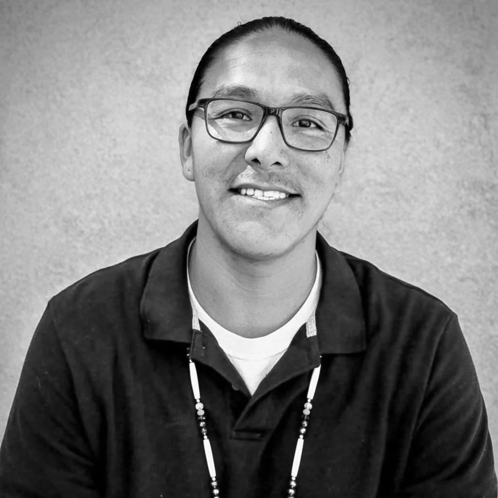
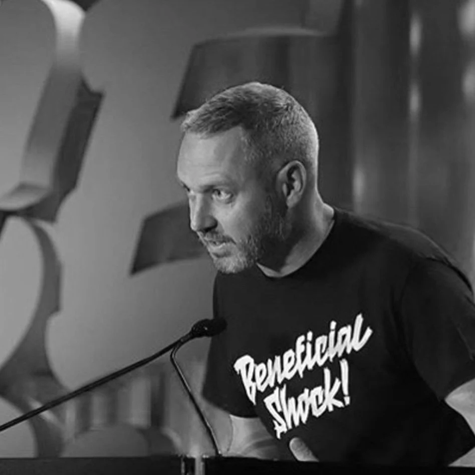
Leo Vicenti
Leo Vicenti (Jicarilla Apache) is an Assistant Professor of Communication Design at Emily Carr University of Art + Design. He holds an MFA from The School of the Art Institute of Chicago (SAIC) in Visual Communication Design and a BA in Graphic Design from Fort Lewis College (FLC). His current research approaches indigenous language preservation, revitalization, and the return of these languages to everyday use through the development of language support in typography and representation in the design field. He maintains practice-based research in exhibition design alongside his creative pursuits in visual communication design.
Linda Byrne
Linda Byrne designs books for architecture and teaches the architecture of books. A research focus on publishing practices and the form of the (physical and digital) book underpin a rigorous, crafted and experimental approach to teaching and practice. Linda is a senior lecturer on the Graphic Design program at Kingston School of Art leading the publishing pathway and interdisciplinary collaboration.
Linda holds an MA Book Design from the University of Reading, a BA in Graphic Design from LCC and is a Fellow of the Higher Education Academy. Formerly a designer at the Walker Art Center, she has been recognized in the AIGA 50 Books/50 covers and has two AIGA Certificates of Design Excellence. Linda is currently art-director of the Royal Institute of British Architects Journal.
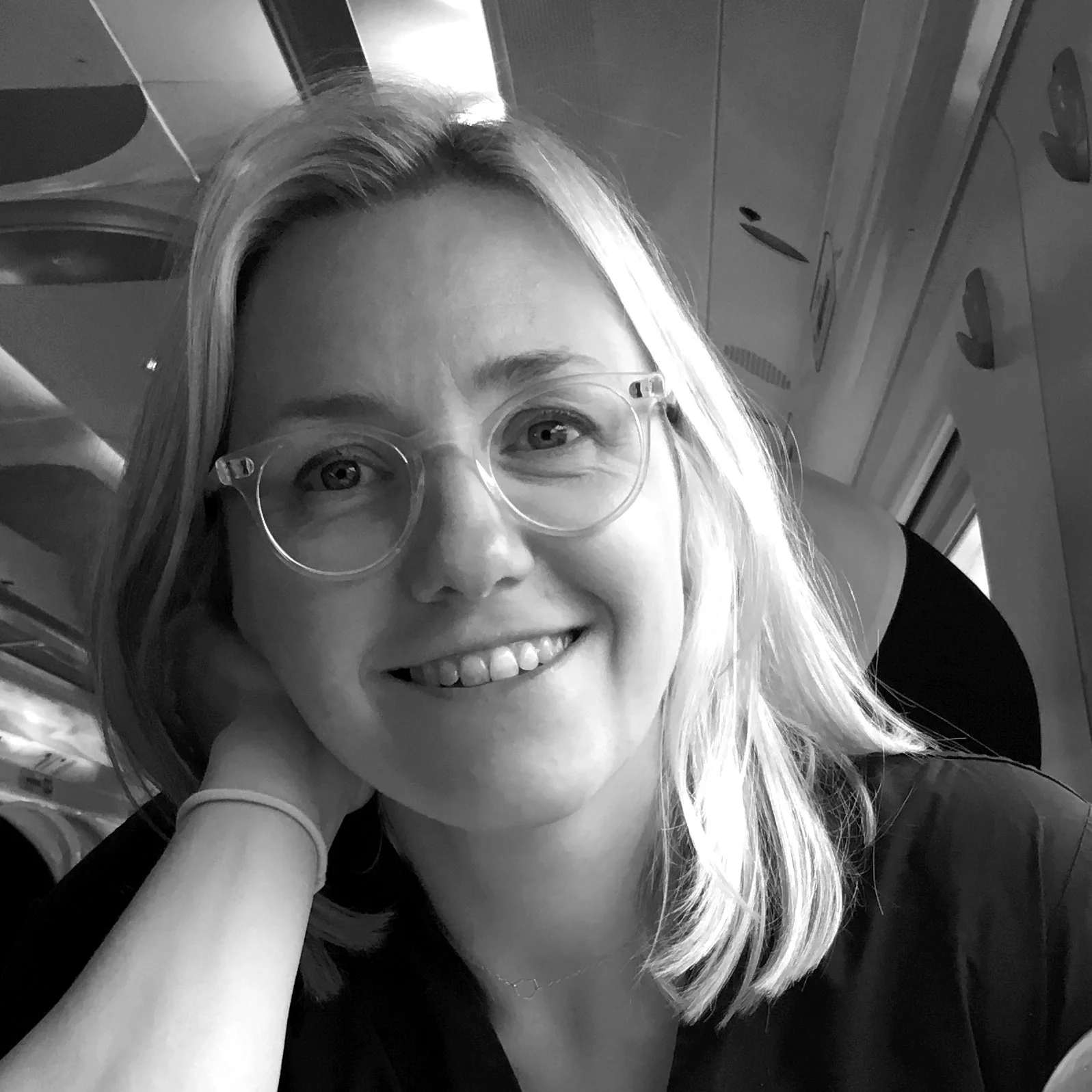
Morgan Page
Morgan Page (she/her) is a graphic designer, researcher, and cross-disciplinary artist residing in North Texas. She is an Associate Professor of Graphic Design at Midwestern State University in Wichita Falls, TX. Her research interests include immersive design and exploring sociological issues through installation, performance, and photography. Her work has been exhibited nationally, and internationally in Mexico and Japan. Her first book, "Bones of Texas," in partnership with her husband Dustin Rice is being published by the University of Texas Press in Fall 2024. She received her MFA from Rutgers University and her BFA from the University of Houston. View her work at morgancpage.com and bonesoftexas.com.

Patrick Gosnell
Patrick Gosnell is an Associate Professor of Graphic Design at Austin Peay State University in Clarksville, Tennessee. He has been teaching courses in typography, branding, and the history of graphic design for the last ten years, and his research focuses on the intersection of music, modernism, and design. Patrick received a BFA in Photography from the University of Georgia and an MFA in Communication Design from Texas State University. His work has been recognized by the University & College Designers Association and Graphis Magazine. He lives in Nashville with his family and can often be found scouring the city’s bountiful record stores.

Pedro Neves
Pedro Neves is a designer that is interested in exploring emerging practices of digital media. With a deep interest in technology and typography, from letterpress to creative coding, Pedro’s approach explores the potential of digital and logical creative processes, when applied to traditional typesetting and graphic design methodologies.
He has worked as a designer for different design studios around the world (CoDe Zürich, 2x4 New York, Studio Dobra) and has taught and lectured on the creative integration of design and technology in Portugal, Switzerland, and the United States.
From 2017–2019 he worked in the archive of Wolfgang Weingart, documenting and archiving the typographic experiments carried out by his students and himself between 1968–2010 at the Basel School of Design.
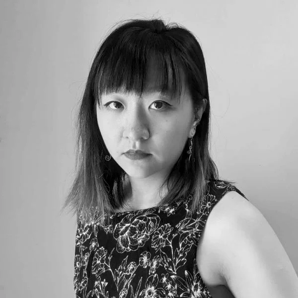
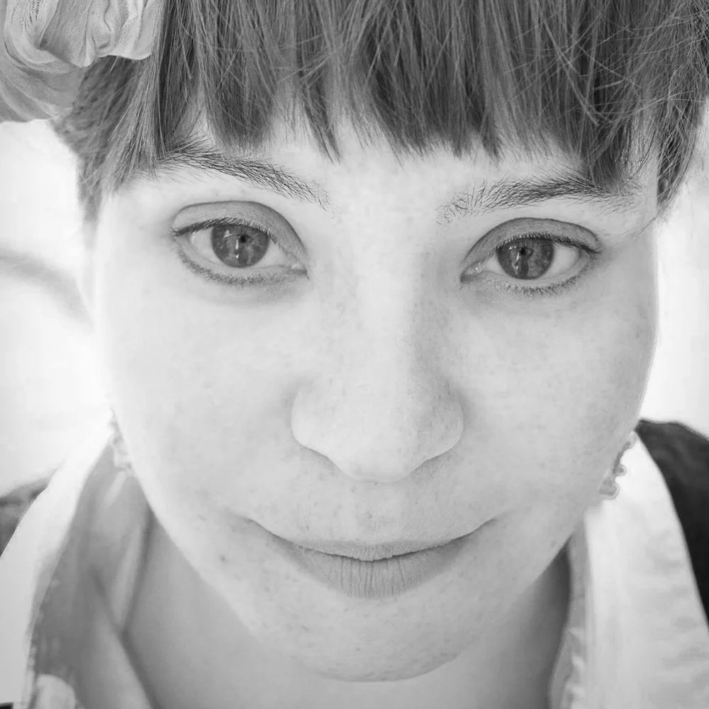
Quentin Bu
—
Quentin Bu is an interdisciplinary designer recently graduated from University of Illinois Chicago Master of Design program. Her academic work focuses on virtual reality and creative coding, sometimes combined with wearable technology and biosignals. Her collaborative virtual reality project OASIS was featured in the Video Game Art Gallery, and her thesis project An Elegy for the Departed was exhibited at the Electronic Visualization Laboratory.
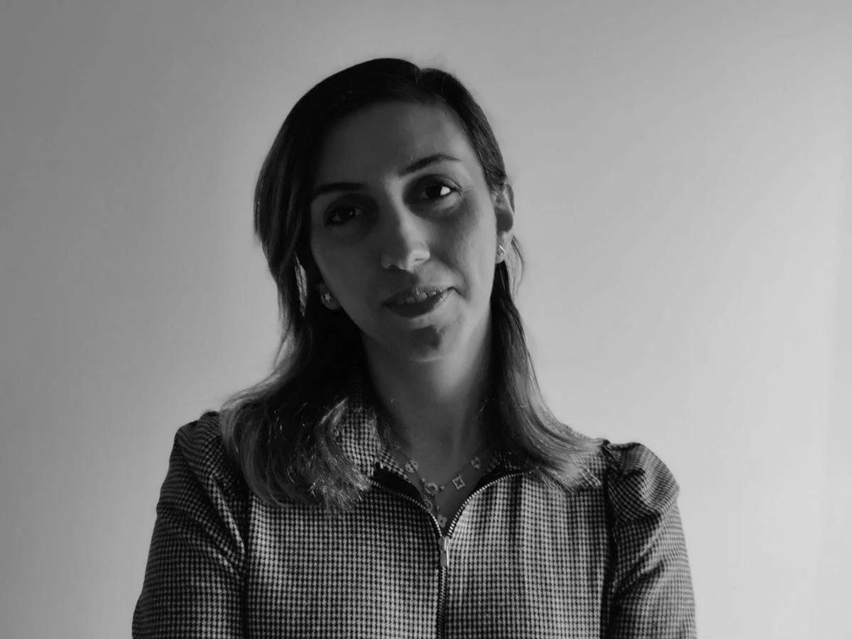
Setareh Ghoreishi
—
Setareh Ghoreishi is a graphic designer and multidisciplinary digital media artist. After receiving her B.F.A. in Graphic Design from the University of Art in Tehran, Iran, she moved to the United States to pursue her MFA in Graphic Design from Florida Atlantic University and a second MFA in Art and Technology from the University of Florida. Setareh explores the role of visual art and design in the interaction between two cultures, Iranian and American, and illustrates different cultural values by using personal experiments through the language of design, digital art, and installations. Setareh is an assistant professor of Graphic Design at Oakland University in Rochester, Michigan.