Friday, July 26
MAIN PROGRAM, DAY 1
11:45–12:00
Opening Remarks
Theresa Dela Cruz & Neil Summerour
12:00–12:45
Keynote Presentation:
Neville Brody
12:45–1:20
Coffee Break & Book Signing
1:20–1:40
Typelandia
Hank Brentlinger
As an Oregon native, I have the privilege of growing up surrounded by excellent design and typography. I have watched as the landscape of signs has evolved, from the evolution of the “Made in Oregon” sign to the still Budweiser-shaped Director Realty sign towering above I-84. I have watched the Sandy Hut and other dives hold their ground as the area around them is consumed by development. I have watched an incredible resurgence of sign painting take hold of the city in a relentless fight to—as they say—“Keep it Weird.” I would love to celebrate the past, including Steve Jobs’s experience with Reed College’s calligraphy program which instilled a love of typography that would inform Apple’s design-first ideology moving forward. I would love to celebrate the present by highlighting the resurgence of sign painting and the pool of type designers currently residing in Portland. Lastly, I would love to celebrate the future as the city of Portland has as of late recognized the importance of muralists and sign painters in bringing life back to downtown after the pandemic. In partnership with Weiden and Kennedy, the city has commissioned new works throughout the city.
1:40–2:00
Typography as a Tool for Social Change:
Unveiling the Power of Masthead Design in Chicano Publications
Alexandria Canchola & Joshua Duttweiler
In the social movements of the 1960s and 1970s, Chicano independent publications harnessed the power of typography to voice demands for justice and equality. This presentation examines how mastheads—the visual forefront of any publication—were designed to reflect the Chicano identity, using typographic choices that resonated deeply with readers. Utilizing findings from archival research in Texas and California, key centers of the Chicano Movement, we examine how these designs resonated with the community’s challenges and goals. By exploring the nuanced ways in which typography was employed to command attention, convey solidarity, and inspire action, this session highlights the critical role of design in social movements. Participants will gain a comprehensive understanding of the intersection between typography, cultural identity, and activism, fostering an appreciation for the strategic use of visual language in community-focused publications. This retrospective insight not only enriches our understanding of past movements but also informs current practices, offering valuable lessons for designers, historians, and educators on leveraging typography as a tool for social change.
2:00–2:20
Unveiling the Magic: Riso Printing as a Tool for Activism and Creativity
Elaine Lopez
Join me on a journey through Riso printing typography’s heritage, techniques, and contemporary applications. From its historical ties to mimeograph printing to its modern-day relevance, we’ll delve into why Riso printing has become a compelling choice for designers seeking to infuse their work with creativity and character. Beyond its aesthetic appeal, Riso printing has emerged as a platform for activism and community engagement. We’ll examine how designers leverage Riso printing to amplify diverse voices and advocate for social causes. Through inspiring examples of type-based Riso animations, poster design, and grassroots campaigns, we’ll showcase the transformative potential of Riso printing as a catalyst for positive change. By understanding Riso printing’s heritage, we can better appreciate its place in the modern typographic toolkit. Discover the unique qualities of metallic gold Riso type and how it adds depth and character to typographic compositions. We will also explore the practical benefits of Riso printing, from its vibrant color options to its cost-effectiveness and eco-friendly footprint.
2:20–2:40
Typography for Culturally Aware Handwriting Education
José Scaglione
Over a two-year period, a dedicated team of six researchers embarked on an ambitious journey to delve into the state of handwriting education across 40 countries globally. Employing rigorous methodologies to gather, validate, and analyze a vast dataset, each country’s unique educational landscape was examined in detail. This meticulous approach has yielded a comprehensive understanding of the evolution and current practices in handwriting education, uncovering trends, challenges, and progressions unique to each locale. This presentation will provide a global overview of the collected data, focusing on the contextual and comparative analysis of these findings. It will also offer a glimpse into an extensive typography project aimed at developing adaptable and localized school fonts, tailored to meet the diverse needs of global handwriting education.
2:40–3:10
Coffee Break
3:10–3:30
Printed Matter? Money Matter or Digital Wallet Matter? Exploring Typeface Dynamics on Currency Design in Eastern and Western Cultures
Xiaojun Huang
When traveling outside of the U.S., do you find yourself exchanging currencies at the airport upon arrival? Have you ever paused to observe your cash truly? These seemingly mundane actions may appear simple, but they hold profound meaning, particularly in currency design. In today’s digital age, dominated by credit cards and digital wallets, physical cash might seem a tad old-fashioned. However, the importance of traditional banknote design remains undeniable. In this presentation, we will explore the captivating world of banknote typography design. We’ll compare design elements across Western and Eastern cultures, uncovering the underlying principles that shape these choices and the cultural narratives they represent. Additionally, we’ll explore how physical currency is adapting to the digital era, including the rise of digital wallets. Whether you’re a cash enthusiast or a digital aficionado, it’s crucial to reflect on the role of physical currency in our increasingly digital world. Join me as we navigate these questions and contemplate the future of currency design.
3:30–3:50
Place-Based Typefaces
Mia Cinelli
What is the relationship between location and letterforms? How might the character of a specific place and time manifest typographically? Engaging with new interpretations of historical letterforms, this talk will explore the process and impact of designing four “site-specific” typefaces—inspired and informed by: a remote ghost town in Upper Michigan, a picturesque island in the Great Lakes, a three-story former thrift store in North Carolina, and a long-defunct textile mill in upstate New York. Investigating the connections between areas and aesthetics, these typefaces seek to celebrate esoteric and often overlooked places, highlighting typeface design as a medium to spotlight local histories, everyday ephemera, personal narratives, and unique locations which otherwise might be ignored or forgotten. Additionally, this presentation will discuss why these works—and others like them—matter in contemporary creative practice, investigating what role regionally-specific visual language can play in both local use and broad dissemination.
3:50–4:10
Material Meaning: Making Letters to Make Landscapes, Weaving Words to Expose the Mutuality of Text
Aoife Mooney
This presentation will chart the trajectory of a research project which integrated type design and textile making to reconsider text as a kind of mediated memory. It will trace the design of letterforms made to shapeshift and obfuscate the interdependency and transparency of a text, from the building block of the individual letter to a more conceptual consideration of a text as an evolving instance of meaning-making. Harnessing type design processes such as variability and interpolation, and experimental weaving techniques on the digital loom, the resultant woven texts explore how gestural action and and physical materiality can intervene in the creation and translation of language. The presentation will thread together questions posed by botanists, philosophers and anthropologists such as Robin Wall Kimmerer, Roland Barthes, Donna Haraway, Lewis Hyde and Tim Ingold, to explore how typography can act as a lens through which to view, or an analogy for, our interconnectedness.
4:10–4:30
Coffee Break
4:30–4:50
Old Dusty Type
Marta Bernstein
What is the importance of physical archives? In a world that is becoming more digital every day, do we really need to preserve all those old paper artifacts? During my 10 year long research on Italian Nineteenth Century type I traveled to many places to visit public and private collections, having the chance to browse through type specimens that were not open for decades. Some surprised me, some other changed my mind. Some were beautifully made, others were cheaply printed. All of them told me a story. Whether you are a seasoned researcher or a design student, come with me back in time to the Nineteenth Century through its overly-decorated, quirky, and extremely lively typefaces. Are they really too old, too loud, and too playful? Can we still learn anything from the past? A journey through public libraries, dusty archives, and long-forgotten books: because what feeds creativity is often waiting in disguise.
4:50–5:10
Preserving your Research for The People!
Briar Levit
Type designers are researchers by default. Many typefaces are based on existing ones, and if not, there is still a process of referencing existing faces with desired characteristics and historical backgrounds. Learn how type designers can share their research with the rest of the design community in The People’s Graphic Design Archive so that even more histories may be linked, studied, and disseminated. I will give an introduction to The Archive, its history, and mission, and follow with a demonstration of how you can participate either in sharing material or in conducting research.
5:10–5:50
Catalyst Award Presentation
Raven Mo
The Society of Typographic Aficionados announced Raven Mo as the recipient of the 2024 SOTA Catalyst Award! Created in 2010, the award recognizes a person 25 years of age or younger who demonstrates significant achievement and future promise in the field of typography, design, and advocacy. Raven will present their work and will be given the award certificate.
5:50–6:00
Closing Remarks
7:30–9:30
SOTA Spacebar
Sponsored by Positype
Location: Second Floor of Jupiter Next Hotel
900 E Burnside St Portland, OR 97214
Distance: 10 minute walk from Revolution Hall
BIOS
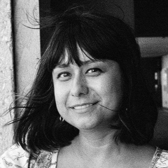
Alexandria Canchola
Alexandria Canchola designs, illustrates, and creates immersive large-scale installations that are inspired by narrative, color, letterforms, and filmmaking. She has worked for publications, small businesses and non-profits in many roles working to solve problems creatively so ideas can come to life. Canchola has a BA from the University of Texas at Austin and an MFA in 2D Design from the University of Texas Rio Grande Valley. She has completed residencies at Otis College of Art and Design and Zea Mays Printmaking. Canchola is currently an Assistant Professor of Graphic Design at Texas A&M University–Corpus Christi eagerly working to assist her students in their quest for knowledge so they may fully understand the power they wield as designers in communicating ideas that change everything.
Aoife Mooney
Aoife Mooney is an Irish interdisciplinary typo/graphic designer and textile artist and educator. She is an Associate Professor in the School of Visual Communication Design at Kent State University in Ohio, USA. She holds an MFA in Studio Art (Textiles) from Kent State University and a Masters in Typeface Design from the University of Reading. Alongside her teaching, she maintains practices as textile artist, typeface designer and typographer. She is a member of the International Society of Typographic Designers and one of the regional coordinators of the ISTD North America Annual Student Assessment Scheme. She regularly presents on her research at conferences nationally and internationally.
Briar Levit
Briar Levit is a Professor of Graphic Design at Portland State University. Levit’s feature-length documentary, Graphic Means: A History of Graphic Design Production, which follows design production from manual to digital methods, established an obsession with design history—particularly aspects not in the canon. She currently collaborates on The People’s Graphic Design Archive, with an aim to help create a more inclusive and participatory design history. Levit’s recently edited book of essays for Princeton Architectural Press, Baseline Shift: Untold Stories of Women in Graphic Design History (2021), includes the research of 19 scholars including herself.

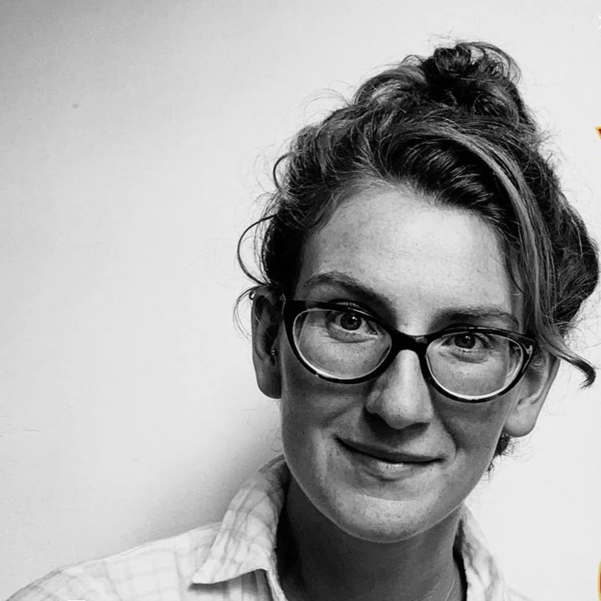
Elaine Lopez
Elaine Lopez is an independent designer and educator. Her practice and research explore the intersection of culture, identity, equity, and Risograph printing. Her studio, LoPress Press, collaborates with cultural and academic institutions to give shape to research. She has served on the board of various design organizations, including AIGA Chicago and the TDC. She holds an MFA from the RISD and a BFA from the University of Florida, both in Graphic Design. She is currently an Assistant Professor and the Associate Director of the BFA in Communication Design program at Parsons School of Design in New York City.
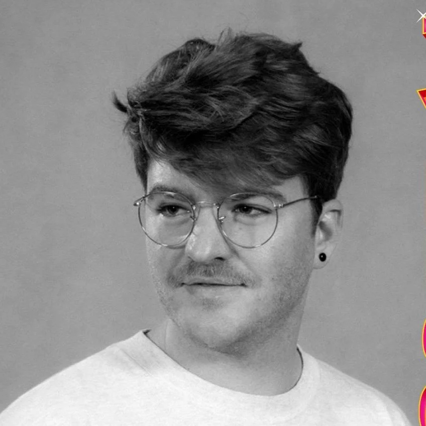
Hank Brentlinger
Hank Makes is the design and lettering studio of Hank Brentlinger, a Portland Native and Bay Area Exile. Hank works with small business owners to create type-forward brands that shine from print to web to walls.

Henrique Nardi
Henrique Nardi (he/him) is a graphic designer, photographer, and typography educator from São Paulo. In 2003 Henrique started Tipocracia, an educational project to promote typographic culture in Brazil. He organized and hosted over a dozen conferences on type and design. In 2015, he served as chair/member of the ATypI São Paulo organizing committee. He taught Graphic, Editorial, and Typeface Design for seven years at the University of Wisconsin. In 2023, Henrique joined ATypI’s board of directors and moved to Augusta, Georgia, to take on an Assistant Professor position at Augusta University’s Department of Art & Design. He is currently the Communication Coordinator for the Tipos Latinos Brasil Committee and a member of the DiaTipo advising board.

José Scaglione
José Scaglione is a typeface designer, lecturer and author specialized in typography. He co-founded the TypeTogether type foundry with Veronika Burian, where they have published numerous award-winning type families. He co-authored books on type design, legibility and typesetting, and frequently acts as a guest lecturer and workshop leader at global conferences and universities. He is a former president of the Association Typographique Internationale (2013–2017), and he co-directs the MA in Editorial Design at the Universidad Nacional del Litoral.

Joshua Duttweiler
Joshua Duttweiler is a designer, artist, and educator. His multidisciplinary practice encompasses personal, collaborative, and client-based projects focused on social justice and community building. The work is a critical exploration of societal systems and constructs that makes way for new voices to be heard through interactive design, curation, and installations. Joshua holds a BFA in Applied Design and Visual Communication from Houghton University and an MFA in Graphic Design from Boston University. He currently resides in Texas where he is an Assistant Professor at Texas A&M University-Corpus Christi.
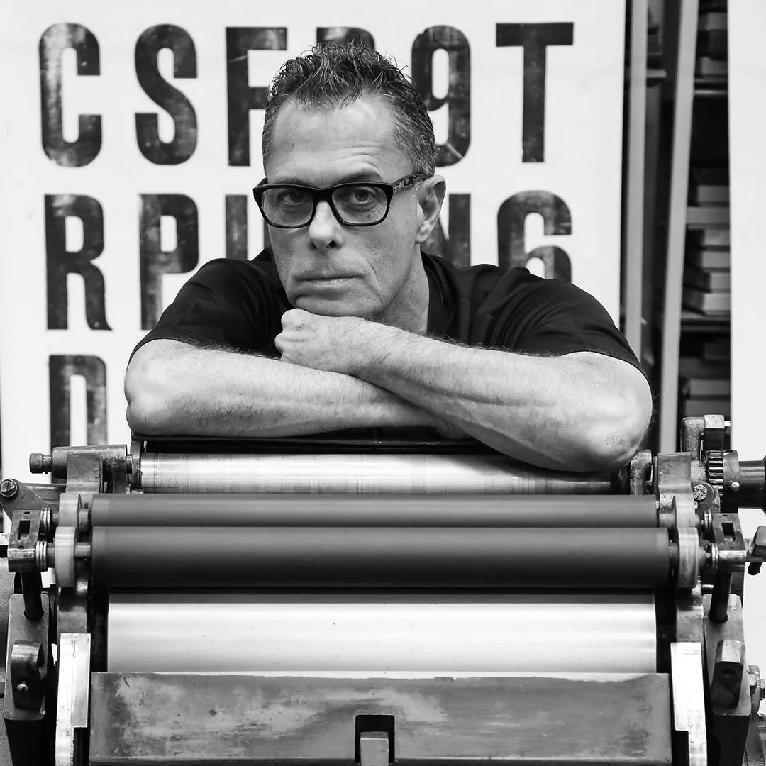
Marcos Mello
Marcos Mello is a professor, graphic artist, and letterpress printer. He graduated in Fine Arts, post-graduated in graphic design, and master’s in Education, Art, and History of Culture. He has a Ph.D. in Social History and is a professor of Design and Typography at ESPM and Link School of Business. Co-founder of Oficina Tipográfica São Paulo, since 1998 he has worked for the preservation of Brazilian typographic memory and cultural projects in Brazil and abroad. For 25 years he has been teaching letterpress courses that are a reference in this area. He is also a partner of Letterpress Brasil, an atelier focused on creating and producing personalized projects.

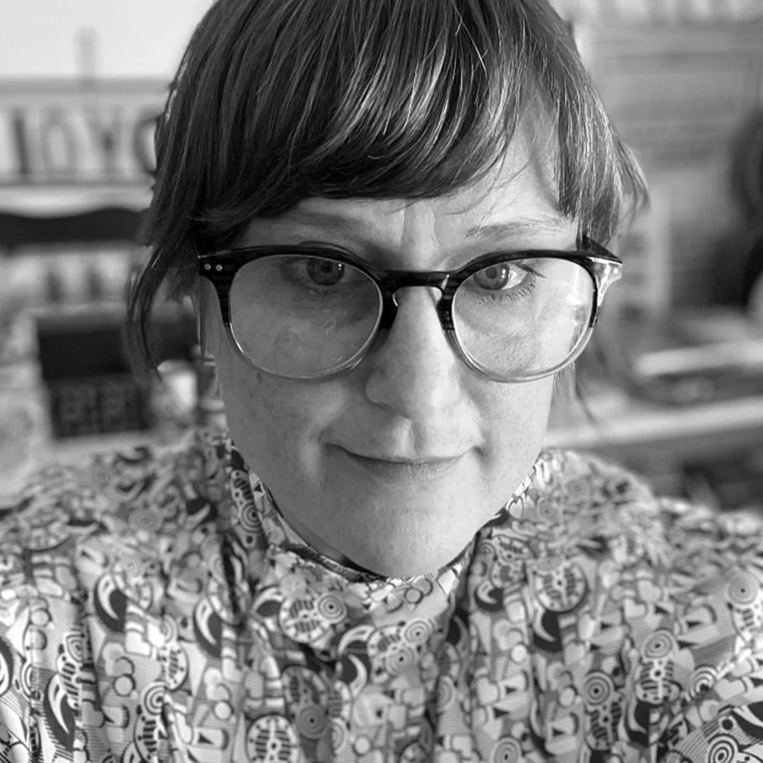
Marta Bernstein
Marta Bernstein is a designer, researcher, teacher and co-founder of the Italian type foundry CAST. She’s creative director at Studio Matthews, a Seattle-based practice of designers, teachers, and makers. She’s taught students at USC Roski, the Polytechnic University in Milan, the University of Navarra, and Tongji University in Shanghai. Type and typography are her true passions and the common threads of all her projects. She has a soft spot for 19th century type, which she’s been researching for more than a decade. She’s given talks at Typographics, ATypI, the Letterform Archive, and the Cooper Union. She’s a member of the Nebiolo History Project, a group of researchers studying the history of Italy’s most prominent type foundry. She holds a MDes in type design from KABK in The Hague.

Mia Cinelli
Mia Cinelli is an Associate Professor of Art Studio and Digital Design at the University of Kentucky. Her practice aims to design meaningful interactions and experiences— encompassing an eclectic span of poetic and pragmatic typefaces, objects, and installations which have been exhibited nationally and internationally. Recently, her typographic works have been acknowledged with Best in Festival for New Work at DesignTO (2020), a Graphis Silver award for typeface design (2018), a Society of Typographic Arts “STA 100” award (2019), and a Communication Arts Typography award (2020). In 2024, her first book “Giving Type Meaning: Context and Craft in Typography” was published through Bloomsbury out of the United Kingdom.
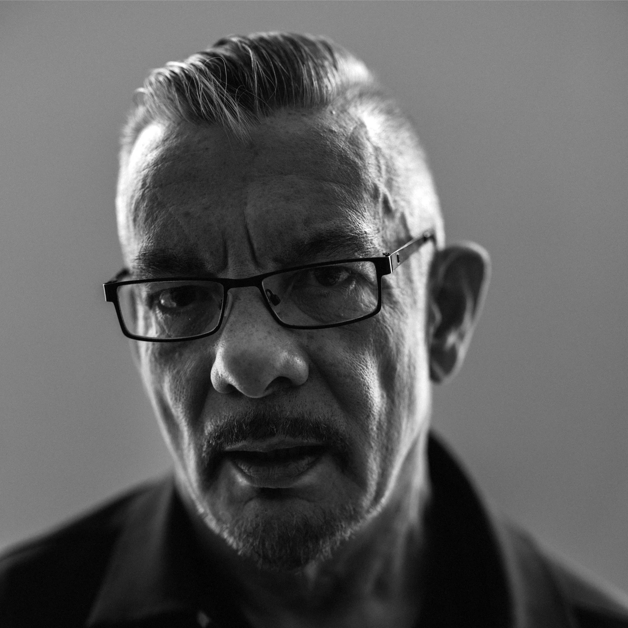
Neville Brody
Neville Brody runs his design agency, Brody Associates, from his London studio, working worldwide with clients such as Coca-Cola, BBC, Sony Music, Channel 4, Christian Dior, Supreme, Mayo Clinic, The Times, Samsung, and Shiseido.
Previously president of D&AD, he is Professor of Communication at the Royal College of Art and a Royal Designer for Industry.
Brody leads his practice with experimentation, exploration, and discovery through influential projects such as FUSE and the ADF. He has always been focused on education and how it can change to better support creative development and opportunity.
In 2023, Brody’s hotly awaited new publication, The Graphic Language of Neville Brody 3 (NB3), was launched in partnership with Thames and Hudson. Six years in the making, NB3 is a major collection of Brody’s work produced over the last 30 years.

Raven Mo
Raven Mo is a New York-based designer committed to pushing the boundary of typography while building a diverse, bold and inclusive future. Her work focuses on the intricate social relations and infrastructures built by type. Previously, Raven worked at VSA Partners, MATTE Projects, and Elevate Brands.

Xiaojun Huang
Xiaojun Huang is a maker, designer, and educator originating from China, currently teaching Graphic Design at Bowling Green State University. In her art-making and design practice, Huang navigates the intersection between Eastern and Western cultures through bilingual typographic graphics, symbols, and installations, exploring the nuances of cultural fusion. Huang’s objective is to spark public discourse on the challenges faced by the younger global generation in maintaining work-life balance. Her work not only reflects the fast-paced nature of contemporary society but also resonates with the working demographic, prompting considerations for adjustments and improvements in the labor system.