TypeCon Daily Schedule
Click to view day:
Saturday
11:50–12:00
Opening Remarks
TBD
12:00–12:40
SOTA Special Presentation
Neville Brody
12:40–1:00
Coffee Break
1:00–1:20
Immersion: Reflections on Fluency From a Cherokee Type Designer
Type designers take for granted our familiarity with the script of our primary language. Our fluency means that the basics—the shape of each character, the placement of thicks and thins—are never in question, making it easier for us to dive right in and experiment. It’s second nature!
But many of us also have languages in our families that weren’t passed down to us, with scripts to which we feel deeply connected but may not feel entirely comfortable designing. As a citizen of the Cherokee Nation, this is where I’ve found myself with regard to the syllabary, our writing system. The Cherokee language is incredibly complex, and, try as I might, I may never master it. But as a type designer, fluency in the design of the syllabary’s 86 characters feels within reach, and, as with language, I think the answer is immersion.
Why might fluency in the design of a given script be important, and how can immersion help? I will share my journey in learning how to design for the syllabary, the challenges that come with trying to understand an underserved script, and how immersion—research, community feedback, and lots and lots of drawing—has given me new eyes and a deeper connection to my roots.
1:20–1:40
Who’s Type is it Anyway?
A talk about reference. As in: the places we get our work from.
With typeface design evolving culturally and becoming more inward-looking, there is a lot of talk about who gets to make type now. But what about the questions about where we get our typefaces from?
I'll be talking about two projects I'm working on: the first is an investigation of gesture and the commonality in which it expresses itself in various spaces around the world, and an attempt to translate this energy to typeface design. The other project is a typeface for sub-Saharan Africa inspired by a Czech poster designer, and couldn't be more different in design or background.
With these, I'll share some of the questions I've been trying to confront about who gets to make type, what are the traditions that we may want to investigate in the newly egalitarian era of type design, and how I've been working on finding answers that make sense not just for my sense of social justice but for the public good that design can be in the right hands.
1:40–2:00
Designing an Arabic Type for Sub-Saharan Africa
Many people are familiar with the myriad of styles of the Arabic script in the Middle East and neighboring areas. Each adaptation of the script embodies the cultural identity of the people who have adopted it. This is also true in Sub-Saharan Africa where it's used for a variety of languages and has its own unique form and function. In fact, this uniqueness was once dismissed as unintelligible Arabic by the Europeans colonists who first encountered it. African ʿAjamī (i.e. the Arabic script used for languages other than Arabic) is still in use today though it lacks widespread support in computing environments. This presentation will take a brief look at the history of the script in Africa, our process in developing a typeface that broadly supports those languages and highlight how technology inadvertently inhibits its progress.
2:00–2:20
QWERTY, History of the Korean Typewriter, and Cultural Inclusivity in Technology
QWERTY refers to the common keyboard arrangement on most of our electronic devices. But do you know what it stands for or from where it originates? QWERTY is attributed to Christopher Lathan Sholes in the late 19th century, and yet it continues to be used today across many languages. This presentation will provide a brief history of the development of the typewriter and describe the typewriter’s long-reaching influence on Korean culture. The typewriter was carried by American military forces to Korea when they displaced Japanese Colonial rule in 1945. The Korean writing system is very different than the English, and this story includes instances where aspects of the Korean system changed to better align with this English-language communication tool. Using the case study of the development of the Korean typewriter, QWERTY’s history and influence are discussed as an allegory to ask questions about cultural inclusivity, access, and equity in the technologies that we use and develop.
2:30–3:00
Coffee Break
3:00–3:20
Historical Wartime Posters: Exploring Ethnically Linked Typography and Its Impact
As an art director and designer, I aim to create impactful designs that instantly capture attention. Through my experiences abroad, I've witnessed varying degrees of political and social disharmony. This has fueled my exploration into the history of social and political advertising, propaganda posters, and the use of signs and symbols for communication.
Join me as we examine World War II posters, focusing on ethnically linked typography and design used to discriminate against minority groups. This presentation highlights recurring trends in typographic communication, including posters, graffiti, fonts, and symbols employed to propagate specific ideologies. We'll explore how these techniques manipulate behavior, exacerbating racial conflicts.
By delving into the past, we cultivate sensitivity to the role of typography in shaping public perception of minorities. We'll emphasize the importance of understanding and respecting diverse scripts and languages as designers, preserving cultural dignity and boundaries.
Uncover the profound influence of political poster design, encouraging meaningful dialogue, and fostering an inclusive and empathetic design practice.
3:20–3:40
Farsi Type in Los Angeles
Since ancient times, script has been considered one of the aspects of culture, and societies have carried this visual symbol with them and preserved it as part of their ancestral heritage. Iranians residing in Los Angeles, are one of the largest immigrant communities in the city. After living in Los Angeles for about half a century, this community has been influenced by other cultures, their interactions with them, and their distance from the Persian language and script, resulting in unique visual characteristics that distinguish it from similar examples. In this lecture, examples of Farsi-written signs for various professions are presented, with an attempt to highlight these features of this immigrant community by describing their characteristics and enumerating them.
3:40–4:00
How Chop Suey font became the face of Chinese food in America
Many Americans have probably seen Chop Suey fonts on Asian restaurant signs, takeout boxes and fortune cookies. It has a distinctive style of wedge-like shapes, and is supposed to invoke Chinese calligraphy. But if you grew up in China, chances are these fonts would be totally foreign to you. In this lecture, Raven Mo analyzes the Chop Suey font — an iconic design cliche that is a unique product of America’s relationship with China, its people and its cuisine. We will unpacks the history, deconstructs the design, and discusses the luxury of authentic cultural expression when fighting for basic human rights.
4:00–4:20
Coffee Break
4:20–4:40
Noneg, a 1990s regional style of graffiti that can help type designers think about letters in new ways.
The modern graffiti writing boom stems from the documentary Style Wars after its initial broadcast on PBS in 1983. As graffiti grew in various regions, writers would emulate the work from the film and also local artists, birthing regional styles that were prevalent throughout the 1990s. Growing up in California, I didn’t have access to work coming out of Baltimore and DC until photographs from those areas made their way into graffiti magazines. These insider documents would showcase specific regions and the new graffiti pieces that were taking shape. One variant of letterforms from that time was “Noneg” aka “No Negative Space”, a way of drawing letters that smash together with only gestural counter shapes. Through photographs, diagrams, and sketches, I will break down this particular style of graffiti piecing, and translate the useful drawing concepts for type design. I started Overlap Type as a place to release projects based on letters that overlap, one of many ideas from my graffiti background that informs my type work today.
4:40–5:00
Through Queer Glass: John Cage’s “Plexigrams” as Queer Typography
John Cage is overlooked as a typographer. His “plexigrams,” titled I don’t want to say anything about Marcel (1969), are a prime example of his contribution to typography and the history of overlooked mid-20th century queer type.
To begin my talk, I’ll look at Cage’s plexigrams in the context of three of Cage’s queer contemporaries: Jasper Johns, Robert Indiana, and Cy Twombly.
Next, I’ll discuss the unique queerness of Cage’s project. First, I’ll explain how Cage used dice, the I Ching, and a type specimen book to choose his many typefaces. By relying on chance, I’ll argue, Cage exteriorizes his relationship with type to make a queer methodology. A method that’s “at odds with the normal, the legitimate, the dominant” (Halperin, 1995).
I’ll then discuss how Cage’s plexigrams are also materially queer. They are at once legible and scuffed. They are fixed but in flux, meant to be rearranged every day. They are queer, in other words, by creating a “fluidity of categories” (Carter, 2005).
To conclude, I’ll explore outlying questions raised the plexigrams and how we might situate them in the landscape of type in the 2020s.
5:00–5:20
Life’s a drag
Drag is many things: the artform of the queer imagination, a shiny distraction from daily banalities, and perhaps more than ever, a cultural lightning rod. It’s curious that this vehicle for boundless expression has fomented so much rage—but perhaps the best explanation is the most obvious one. Drag, and queerness more broadly asks: is this enough for me? It’s a slippery, bejeweled slide into asking these questions of our communities and relationships, our structures and governments. Maybe this permission to take things less seriously is exactly the cherry-flavored balm we need.
This talk will use my decade of experience in the letter arts to frame drag as the perfect community-focused, anti-capitalist tool for navigating the world. After all, a transcendent drag number and a striking piece of design share much in common: a respect for tradition tempered with the need to poke fun; the delight of a well-timed reveal or surprise; and the license to pour glitter on our blemishes and relish in taboo.
5:20–5:30
Closing Remarks
Special Acknowledgments
SOTA Board
7:30–10:00
TypeCon Farewell Party
Location: SHOW BAR on the First Floor of Revolution Hall
1300 SE Stark St #203, Portland, OR 97214
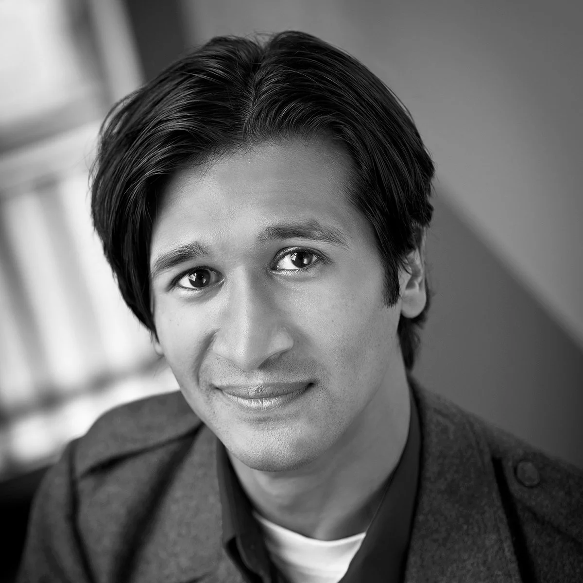
Agyei Archer
Over the past 30 years, I have worked on the typography of many of the world's languages. Propelled by the rapid adoption of the Unicode Standard for the scripts of the world, I have had the privilege of getting acquainted with numerous scripts both from both the technical and esthetic point of view. In the early 2000s, I became immersed in the newborn field of multi-script fonts, leading me to ponder and decide which styles of diverse scripts go well together. Later on in my career, I played a significant role for several years in the Google Noto Font project, leading me to learn more scripts than I had imagined possible. Throughout my career, I have labored to understand what makes a type style look native to its readers.
Alice J Lee
Alice J Lee 이정연 is a second-generation Korean American designer, researcher, and educator. She researches alphabetic systems, concepts of interconnectedness, and the impacts of cultural imperialism. She has exhibited bodies of work and interactive installations at Auburn University, the Franklin in Chicago, Washington Pavilion in Sioux Falls, and other galleries, and presented her research at international conferences, including TypeCon and CAA, and other venues that include the Sejong Institute, Notre Dame University, and the University of Houston. Recent design commissions include the artist monograph, Bethany Collins: A Pattern or Practice, and the exhibition catalog, An Infinite and Omnivorous Sky, both funded by the Warhol Foundation.
Chris Skillern
Chris Skillern is a type designer and citizen of the Cherokee Nation from Tulsa, Oklahoma. A 15-year-long obsession with drawing type led Chris to Type West, the Letterform Archive’s type design certificate program, in 2021, where he designed Meli, a type family inspired by his daughter, which supports the Latin alphabet and the Cherokee syllabary. Since graduating from Type West, Chris has had the opportunity to work with foundries like A+ and XYZ Type on custom type projects for brands big and small. When not assisting other designers, he stays busy with his own foundry, Tulsey Type, which features his friendly, lively, and detailed designs for Latin and Cherokee. He is currently working with the Cherokee Nation Language Program and others on new fonts for the syllabary.
Joshua Unikel
—
Joshua Unikel has lectured at AIGA Design Educators Conference, ReViewing Black Mountain College Conference, The Open Book Workshop, AWP, and NonfictioNow. His work has been shown at the 2022 AIGA National Conference; Dubai Art Season 2020 (United Arab Emirates); Sofia Art Week 2019 (Bulgaria); Īzmir Katip Çelibi Üniversity Art Gallery (Turkey); Aether Gallery (Bulgaria); Griffith University Art Gallery (Australia); The Museum of Contemporary Art Detroit; DesignPhiladelphia; and the Florida State University Museum of Fine Arts. Unikel is an assistant professor in the University of Houston’s School of Art.
Kel Troughton
Kel Troughton is a type designer, lettering artist, graffiti writer, and educator, living in Oakland CA. He works with Letterform Archive to collect graffiti magazines, drawings, and books. Kel is a co-curator of the exhibition “Subscription to Mischief” at Letterform Archive, showcasing the 1990s graffiti community and the independent publishing that documented it. He started writing graffiti in 2000 and has continued to add letter-based interests ever since. He studied Type design at Type@Cooper West, worked at Monotype, and currently works on freelance type and lettering projects. His company Overlap Type focuses on type design that utilizes ideas from his graffiti experience. In short, Kel is a letter person.
Kourosh Beigpour
Based in Los Angeles, Kourosh Beigpour is an award winning graphic artist/designer whose works have been published in more than twenty countries, with countless editorials and interviews that showcase a prolific portfolio of contemporary-merged-traditional design. Over the past few decades, Kourosh has designed for a wide range of clientele, such as Google, the Broad, Getty, and Powerhouse museums, Canada Type as well as a multitude of universities and cultural/educational institutions, such as UCI, UCLA, NEIU & OSU.
Kyle Letendre
Kyle is a human rhinestone machine based in Portland, Oregon. Their work explores letterforms as vessels for expression, blurring the binaries between type and image. As a commercial lettering artist and illustrator, Kyle has worked with brands like Target, Penguin Random House, YouTube and Instagram. Informed by their love for all things soft, gaudy and gay, Kyle believes in one thing above all else: it could always be more queer.
Mark Jamra
Mark Jamra is a type designer and former professor of graphic design, who has designed and produced typefaces for 40 years. He is the founder of TypeCulture, an online type foundry and academic resource, and is a founding partner of JamraPatel, a studio creating innovative type systems with multiple scripts for use in under-supported language communities. Mark has taught letterform and type design at colleges and in workshops in the U.S. and Germany. His typefaces have received recognition from the TDC and the Association Typographique Internationale (ATypI).
Neil Patel
Neil Patel is a type designer and former semiconductor process engineer based in Portland, Maine. He is the founder of Tetradtype, an independent type foundry, and a founding partner of JamraPatel, a studio which focuses on typefaces, keyboards and apps for indigenous scripts. Neil’s collaborative logotype designs with local studios have been featured in How Magazine and Comm Arts. He has also been known to dabble with programming, which he ties back into his design practice.
Neville Brody
Neville Brody runs his design agency, Brody Associates, from his London studio, working worldwide with clients such as Coca-Cola, BBC, Sony Music, Channel 4, Christian Dior, Supreme, Mayo Clinic, The Times, Samsung, and Shiseido.
Previously president of D&AD, he is Professor of Communication at the Royal College of Art and a Royal Designer for Industry.
Brody leads his practice with experimentation, exploration, and discovery through influential projects such as FUSE and the ADF. He has always been focused on education and how it can change to better support creative development and opportunity.
In 2023, Brody’s hotly awaited new publication, The Graphic Language of Neville Brody 3 (NB3), was launched in partnership with Thames and Hudson. Six years in the making, NB3 is a major collection of Brody’s work produced over the last 30 years.
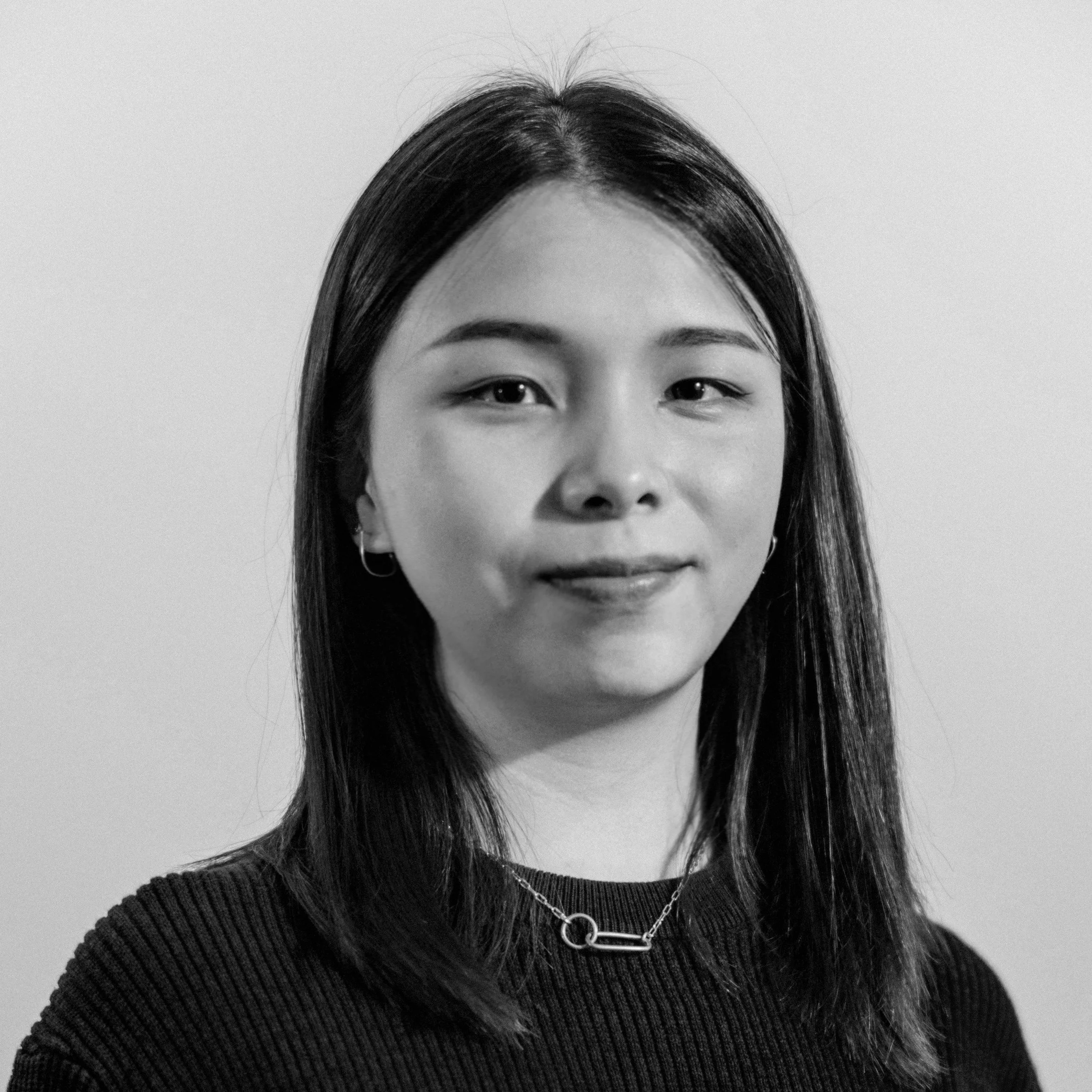
Priyanka Patil
Priyanka is an Senior Art Director at FCB Health NY, specializing in leading pharma brand campaigns. With a Master's degree in Advertising from the Savannah College of Art and Design (Atlanta) and a Bachelor's degree in Commercial Art and Graphic Design from India, she brings extensive expertise to her work. Passionate about design and art, Priyanka explores diverse mediums to create captivating experiences. She has presented at Typography Day 2019, analyzing the intersection of racially linked typography and political conflict. Priyanka has also contributed to tactile typography innovations for the visually impaired, with her publications showcased at the Industrial Design Center - IIT Bombay.
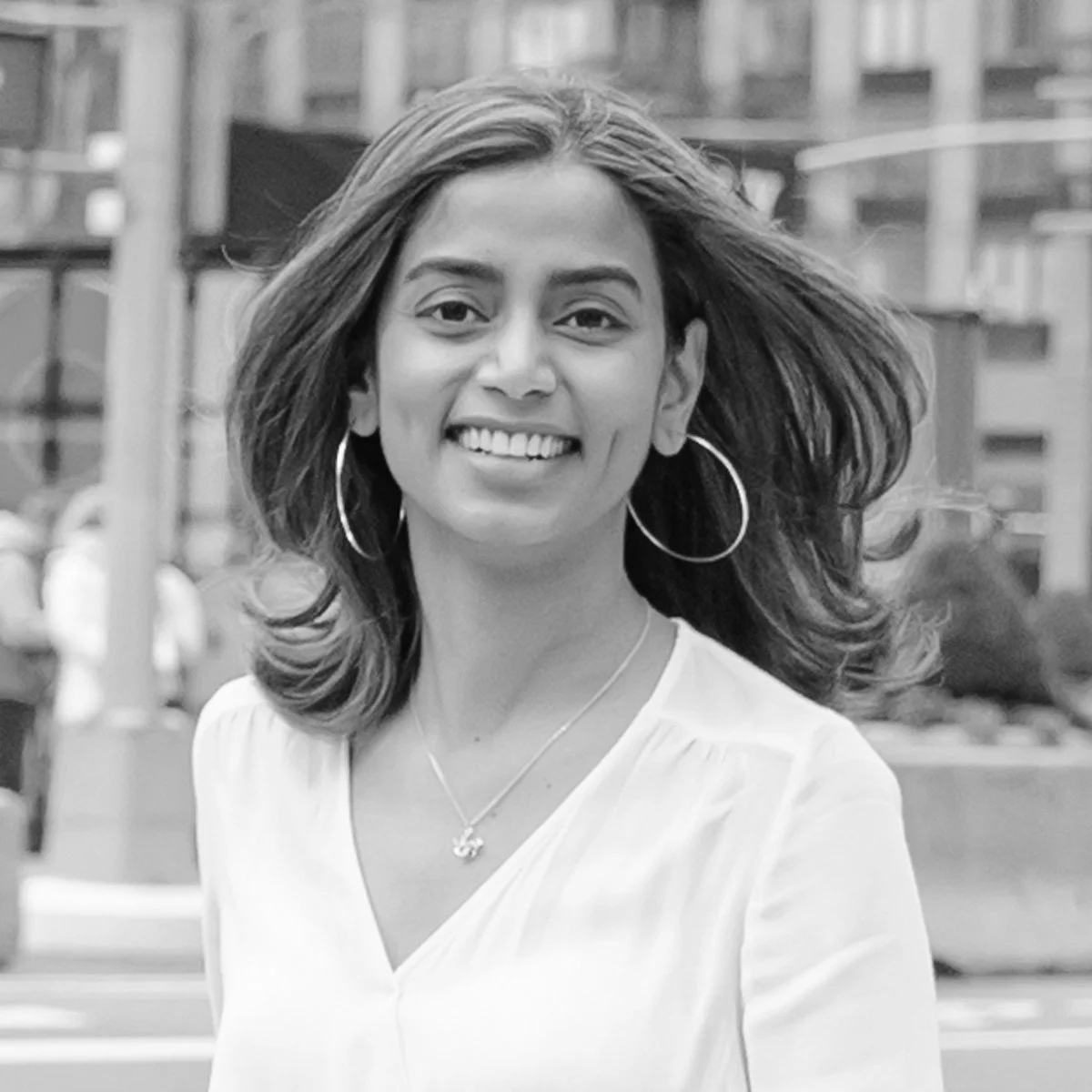
Raven Mo
Raven Mo is a New York-based designer committed to pushing the boundary of typography while building a diverse, bold and inclusive future. Her work focuses on the intricate social relations and infrastructures built by type. Previously, Raven worked at VSA Partners, MATTE Projects, and Elevate Brands.